 USA
USA How To Convert Donors Through Smartphones

Since their debut, smartphones have entirely changed the way we do things. Non-profits have taken full advantage of this tech revolution and are doing an amazing job spreading awareness for their causes thanks to amazing new apps and trending social media channels (take a look at our blogs about social media and trending apps). Smartphones have made donating easier than ever with simple ‘tap to donate’ buttons, much like ‘donating on the go’. How can you influence a visitor into becoming a loyal donor?
Access and speed
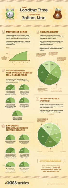
The journey starts with access to your website. Not only must it be mobile compatible, but it should load fast too. Google states, Research has shown that any delay longer than a second will cause the user to interrupt their flow of thought, creating a poor experience. [i].Another study shows that after 4 seconds, 25% of your visitors will have left your website[ii]. Needless to say, you want to make sure you fall under the less than a second loading time group. If your website is a little slower than desired, do not worry, here are ways to fix it. Google provides a detailed checklist to go through to ensure your mobile website it optimal.
Up-to-date website
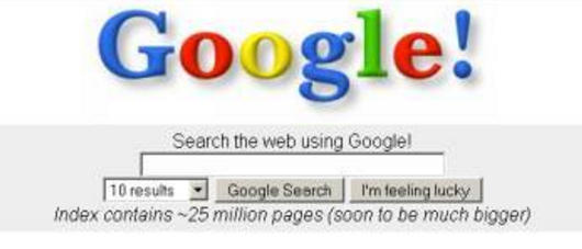
Have you ever researched something on the internet and landed on a page that looks as dated as Googles first landing page? Can you believe it has been 20 years since Google began in 1998? We’ve come a long way since then and as people are more on the go, smartphone browsing is increasing in popularity. In fact, Google now suggests that companies build their mobile website first due to the increase of Google searches on devices. For this reason, the layout of your website on a smartphone is important, and more notably, it links directly to the speed of loading. The fact that your website is accessible with a smartphone does not necessarily mean it is mobile friendly. If the entire page doesn’t fit the smartphone screen and respond in real-time, then your website is not mobile compatible. Besides, your mobile site should be a different experience to visiting your desktop site as the goal is likely to be different.
Up-to-date content
Updating your website with new content proves to be a great asset. Not only will your visitors come back more often to check the updates (and potentially donate) but it is also another chance for you to connect with your returning or new visitors with fresh and different content. In other words, keep your website alive!
If you deliver constant, innovative, touching and/or fun content, it may be a good thing for you to create an app version of your website. Your application widget will be a constant reminder of your cause on your supporters screen. You may also offer the option for your supporters to save their payment details on the app, and make donating easier than its ever been. If you do have an application, advertise it on your website by including the information at the top of your page, offering the option for the visitor to simply scroll down if not interested. It is important to avoid additional steps to reaching your main page. The shorter the journey, the better the user experience.
Strong call to action
You are a nonprofit seeking donations in order to accomplish a mission. There are simple ways to optimize your call-to-action (CTA) button. Here is some advice from LoginRadius:
1) Text: Is your call-to-action clear? Does it create a sense of urgency? Is it short and to the point? Does it communicate value?
2) Placement: Is your call to action above the fold? Is it in a logical place where users would most likely take action?
3) Size: Is your button easy to find? Is it too big that is has become a distraction? Is it easily identifiable as a CTA button? Is it sized appropriately for mobile?
4) Color: Does your button visually stand out from the rest of the page? Is there enough white space surrounding it? Have you tested which colors provide you with the most clicks?
To give you some more insight, here are a few key statistics:
- 90% of visitors who read your headline with also read your call-to-action.[iii]
- Red CTAs buttons have increased conversion rate by 21% in a Performable study.[iv]
- Reducing clutter around a CTA button may increase your conversion rate by 232%. [v]
Another important tip for your donate process is that tapping the CTA button should not take the user to a completely new page. It should still be part of your website, using the same domain. Additionally, taking advantage of the smartphone revolution allows you to make payments easier than ever, by offering Apple Pay or Google Wallet as a payment option. Of course, credit cards, PayPal or Facebook remain a safe and easy way to make a payment too.
Knowing that the average person spends 23 days a year using a smartphone[vi], it is definitely worth making the adjustments suggested. By following those 4 steps, you are ensuring an optimal journey to your visitors and are more likely to convert them into donors!


Jordan Morris
Givergy
Jordan joined Givergy after studying Politics with International Relations at the University of York. He has over two years experience within the charity sector working as a face-to-face fundraiser and as a constituency campaigner. After experiencing the sector from within and knowing first-hand the impact digital solutions can make to fundraising strategies, Jordan is now dedicated to innovating the way charities fundraise to ensure they maximise returns from every fundraising campaign.
Fundraising Events: Why Technology is Just as Important as the Donors
February 29, 2024
Unique Fundraising Ideas for Easter 2024
February 29, 2024
Valentine’s Day 2024: How to Engage Donors During Seasonal Fundraising Events
January 26, 2024
The Power of Appeal Moments: Complete Guide
January 26, 2024
2024 Fundraising: Five New Year Goals To Adopt for Successful Fundraising
January 26, 2024